
Q&A with NurtureSource Designer Hillary Tierney
Q&A with NurtureSource Designer Hillary Tierney
If your home needs a refresh for fall, there’s no easier way to do this than with a brand new coat of paint. Instead of defaulting to the grays and neutrals that have become ubiquitous, consider leaning into bolder, more exciting colors. After all, the fashion and interior design worlds are in a Barbie moment, and we say go ahead and embrace it. From hints of lavender and sophisticated pinks to brown hues and bold shades of red, we’re seeing a spectrum of trending colors for fall.
Our NurtureSource pick for the season is blue-green jewel tones, which have a timeless appeal that lends a sense of calm and serenity to any space. We tapped NurtureSource’s designer and color expert Hillary Tierney for her thoughts on this trending color for fall. Keep reading to see what she has to say. And if you’re interested in consulting with NurtureSource on color selection for your home or listing, let’s talk. Schedule an introductory call.
Q: What are your thoughts on blue-green jewel tones as a trending color for fall?
A: Blue-green jewel tones are a fantastic choice for fall as they evoke a sense of richness and warmth while maintaining a connection to nature. They harmonize with the changing outdoor scenery and can infuse interiors with a cozy yet sophisticated atmosphere, making them a strong choice for fall decor trends.
Q. What does this color family evoke?
A. Blue-green jewel tones evoke a sense of serenity, depth, and versatility. They can bring calmness to a space – reminiscent of tranquil waters – while offering the versatility to be either soothing or bold, depending on how they are used. This color family's connection to nature and gemstones adds a touch of luxury and elegance to any design.
Q. What areas of the home would you recommend this color for?
A. Blue-green jewel tones are versatile and can be used in various areas of the home. Inside, they work well in living rooms and bedrooms to create a serene and inviting atmosphere. Consider using them in dining rooms or accent walls for a bold statement. Outdoors: these colors can be used on front doors, shutters, or exterior trim to add a pop of color and curb appeal.
Q. Have any recent NurtureSource projects featured this blue-green color palette?
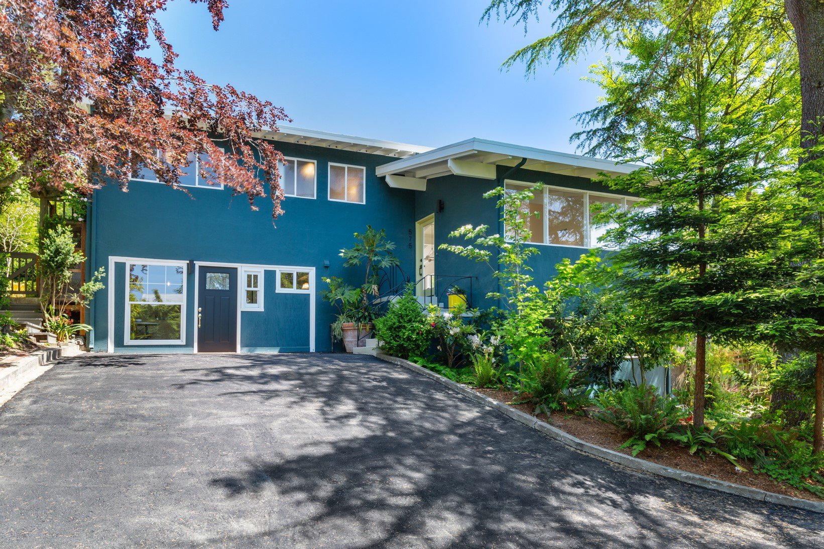
A. We recently used Benjamin Moore’s Amazon Green 2136-30 for the exterior of 575 Grizzly Peak Blvd. in Berkeley. Benjamin Moore describes this dark blue-green hue as gently clouded, conjuring the lush emerald depths of the Amazon.
Q. What are some specific colors in this blue-green palette that people can try at home?
A. For darker blue-green shades, I’d recommend Benjamin Moore’s River Blue 2057-10, which the company describes as a deep teal that’s almost black, offering endless allure and sophistication. People might also like Pacific Sea Teal 2049-10 that’s deepened with a hint of navy and Dollar Bill Green 2050-20, a dark green with blue undertones that conveys luxury and sophistication.
For lighter blue-green shades, I’d recommend Benjamin Moore’s Smoke 2122-40 – which is an approachable and versatile medium gray softened with blue-green undertones – and their gentle green Antique Jade 465 that’s dappled with gray tones.
NurtureSource Is Here to Help
Follow us @nurturesource on Instagram and sign up for our newsletter to check out our latest projects, or schedule an introductory call to see how we can help you with your home or listing.